
How to Choose a Curtain Colour
Choose curtain colour in relation to daylight, orientation, flooring, furniture and fabric texture—not by matching the wall alone. Viewing a physical sample in the room is the most reliable way to understand how the colour changes through the day.
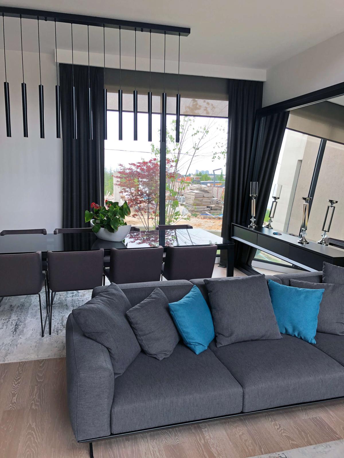
Natural light and orientation
Cooler indirect light on a north-facing elevation and strong warm light from the south or west can make the same fabric look quite different. Morning, midday and evening light may bring out grey, beige or yellow undertones in an apparently neutral colour.
Do not choose the colour under showroom lighting alone. View the sample beside the window, in shade and under the room’s artificial lighting.
Walls, floors and permanent finishes
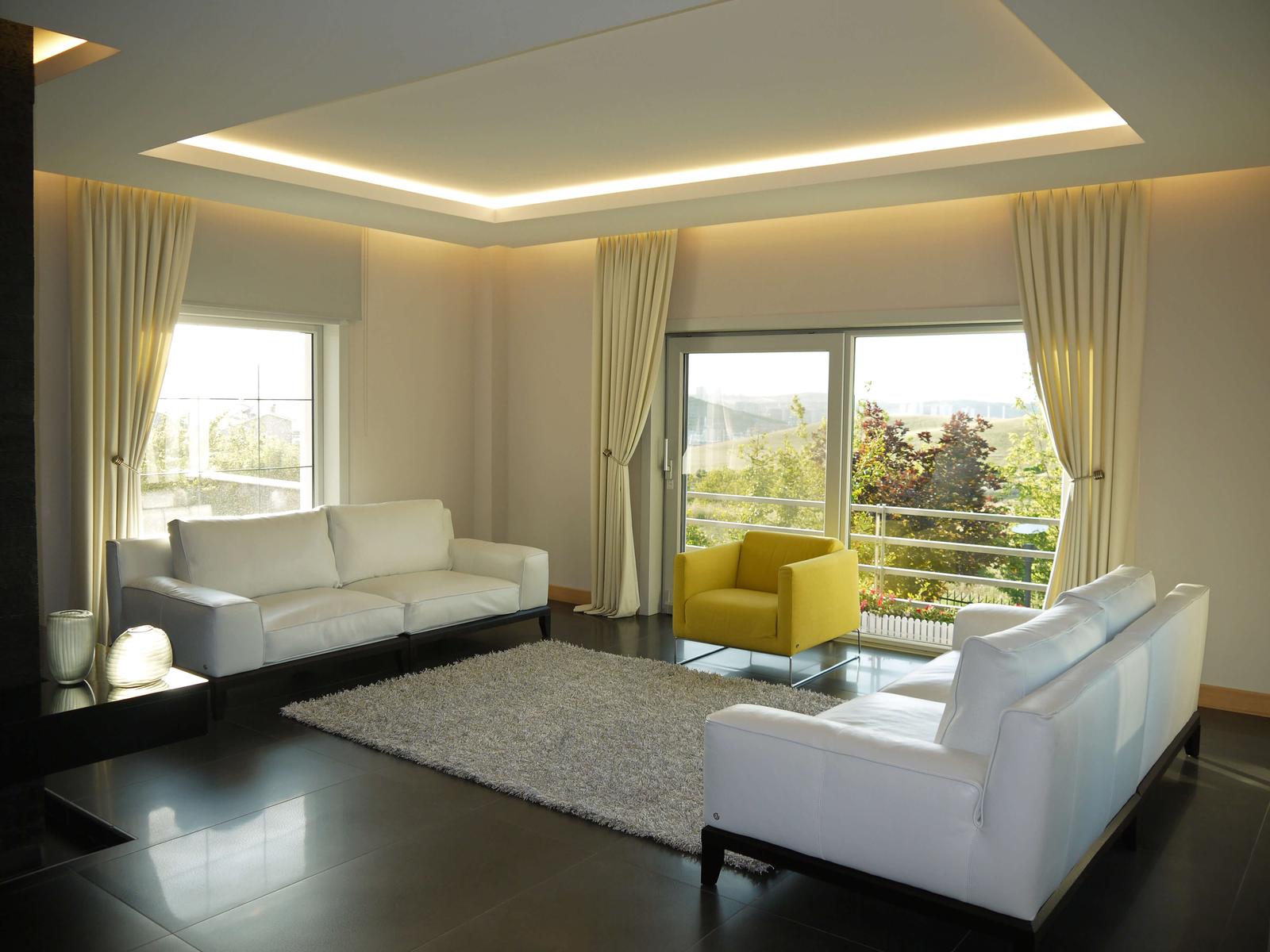
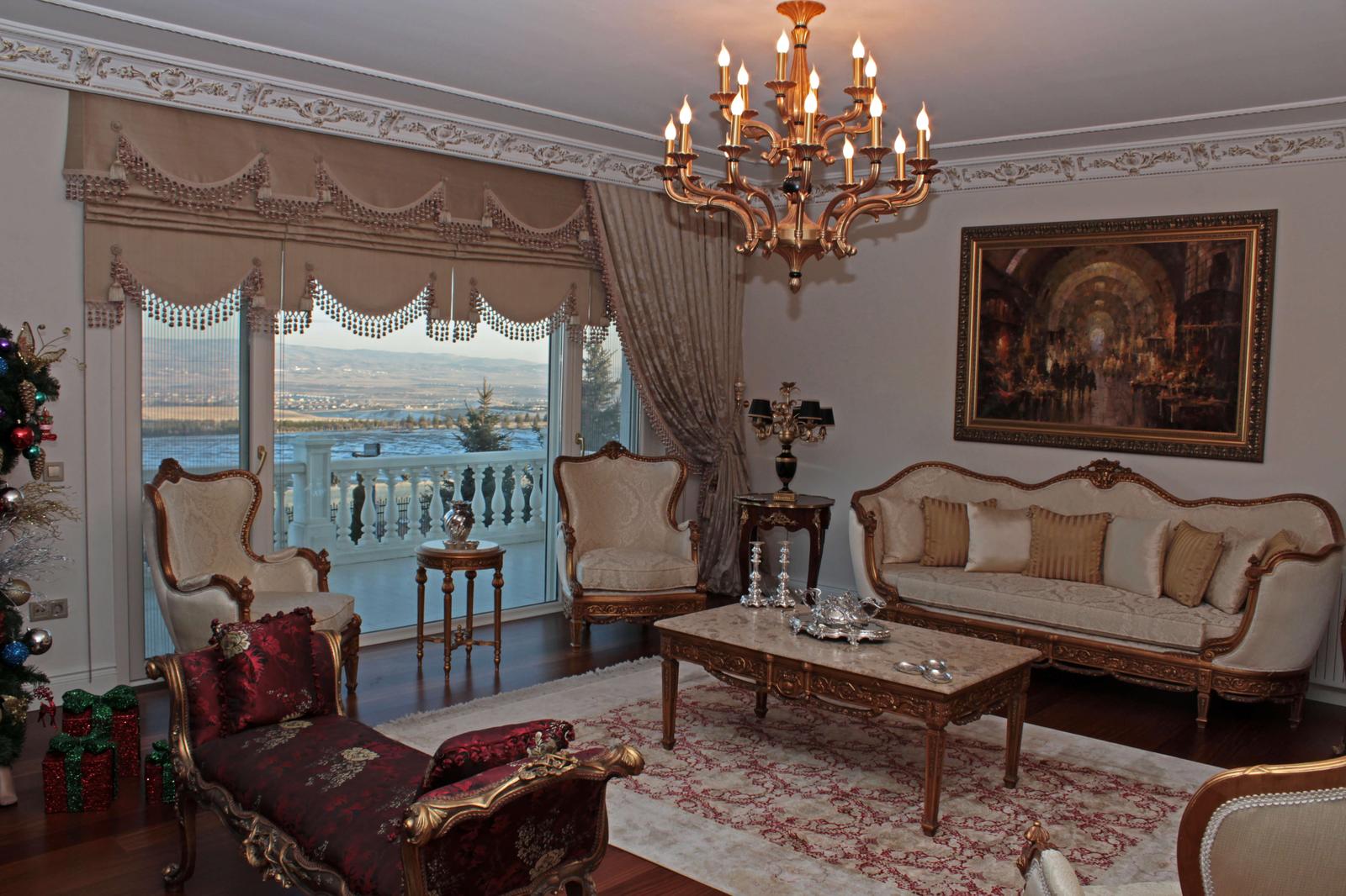
Curtains need not match the wall exactly. A fabric that shares the warm or cool undertone of paint, timber flooring, stone, marble or window frames can create a more natural transition.
Because the floor is a large surface, a slight yellow, red or grey undertone that seems minor on a small swatch may become obvious when the curtains are closed. Consider permanent finishes before easily changed accessories.
The relationship with seating and upholstery
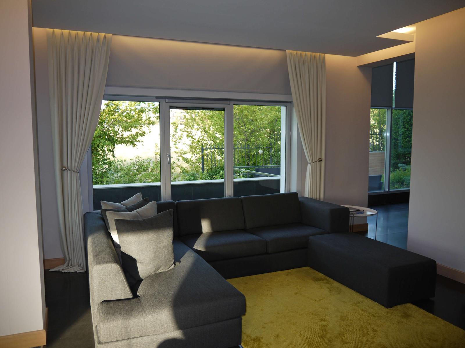
Curtains and seating do not have to be the same colour. Related undertones, contrasting texture or a secondary colour repeated between fabrics can create a more layered scheme.
A calm curtain may balance heavily textured upholstery; a stronger curtain colour can provide a controlled accent beside neutral seating. Compare both samples together in the actual light.
Distinguishing warm and cool undertones
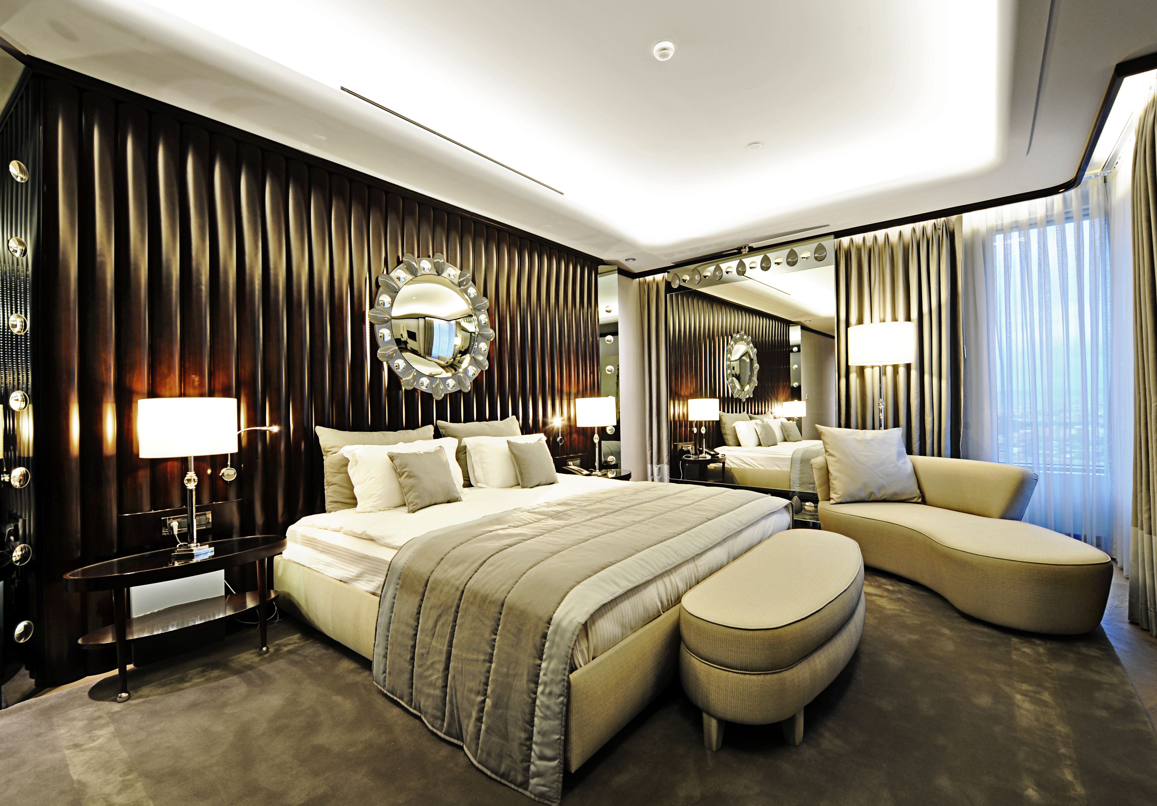
Beige, grey and white all carry undertones. Cream and sand often read warm; blue-grey and optical white feel cooler. When undertones conflict, colours that look attractive separately can appear dull or disconnected together.
The relationship with timber, metal, stone and textiles matters more than the colour name. Compare the sample with the room’s actual materials rather than against plain white paper.
The effect of light and dark curtains
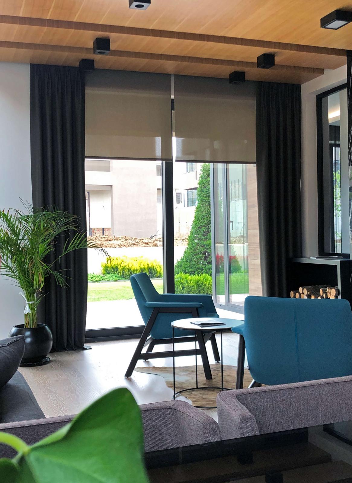
A pale curtain keeps daylight visually prominent and can recede across a large surface. A dark or saturated full curtain frames the window more emphatically and carries greater visual weight when closed.
Dark colour does not automatically mean better room darkening; that depends on fabric construction and fitting. Decide light versus dark in relation to transmission and use as well as appearance.
Considering sheer and full-curtain colours together
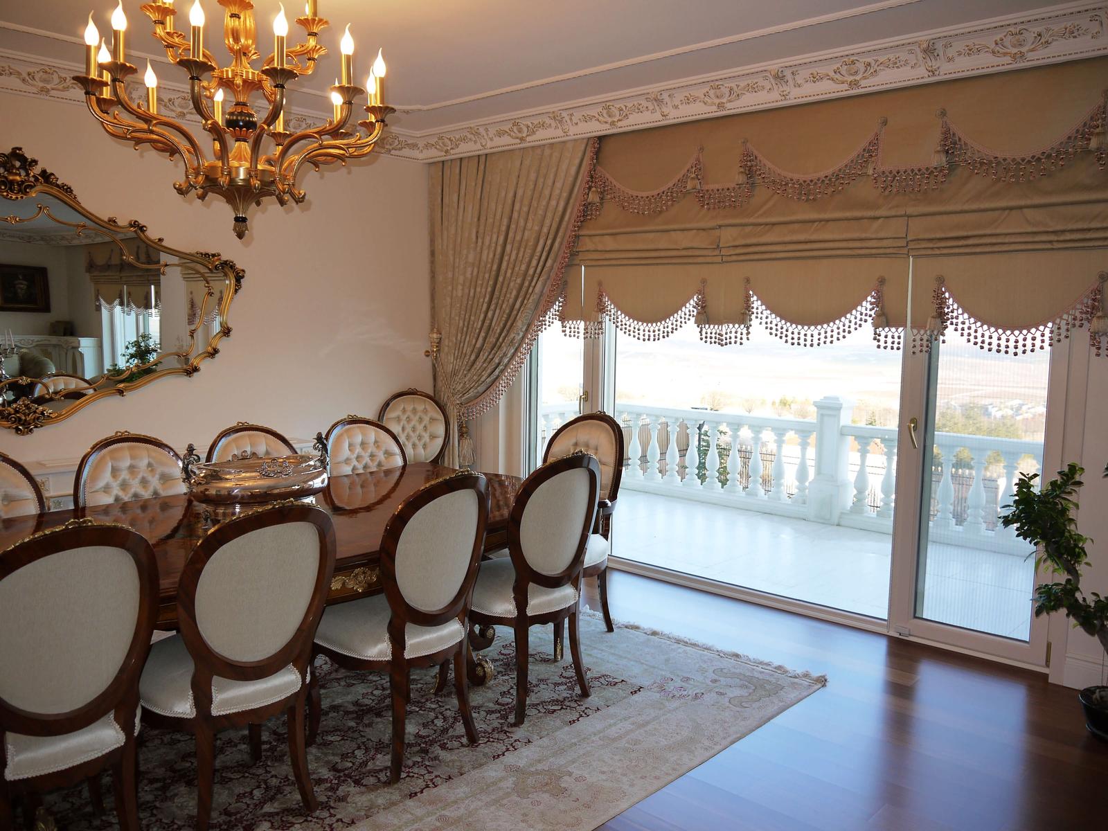
Backlighting can make a sheer appear paler or cooler, while the full curtain casts a different shadow beside or in front of it. Review the two layers together at the window rather than as separate swatches.
The off-white, ecru or grey direction of the sheer should relate to the undertone of the outer curtain, although an exact match is unnecessary. Differences in texture and transparency can create depth within closely related colours.
Colour in small, large and double-height rooms
A broad, very dark and high-contrast curtain can dominate a small room, while the same colour may form a balanced focal point in a large, bright living space. On tall or wide glazing, the effect of the sample is multiplied by the quantity of fabric.
Judge wide openings with the curtains both open and closed. Stack-back, wall colour and the view beyond the glazing all form part of the composition.
Main and secondary colours in patterned fabric
Identify both the colour that dominates from a distance and the secondary shades visible close up. Folds conceal part of the repeat, so a small sample cannot show the final distribution of colour.
Pattern scale should not compete with rugs or upholstery. A large repeat may read calmly over a broad area, while a small dense pattern can become much busier on a closed curtain.
Neutrals, accents and longer-term choices
A neutral is not merely the safest option: with the right undertone and texture it can provide a durable background that supports the architecture. Strong colour is often more flexible when confined to a full curtain, trim or another controlled area.
There is nothing wrong with choosing a current colour, provided it suits the material palette and intended life of the scheme rather than being selected for fashion alone. Separate easily changed accents from longer-lived surfaces.
Assessing samples in the showroom and at home
A screen image or small colour card cannot convey texture, sheen or light transmission accurately. View a generous sample beside the walls, floor and seating in morning, midday and evening light.
Comparing sheer and full-curtain layers, heading styles and artificial lighting in the showroom helps narrow the options. Confirm the final choice with the survey and the actual room.
Quick selection guide
Test colour in context
- Read the fixed paletteIdentify undertones in walls, floors, joinery and major furniture.
- Compare the layersView sheer, full curtain and upholstery samples together.
- Check changing lightAssess the sample in daylight and the room’s evening lighting.
Related solution