
Coordinating Curtains and Upholstery Fabrics
Curtains and upholstery do not need to use the same fabric or colour. A coherent scheme comes from balancing undertone, texture, pattern scale and the role each surface plays in the room.
Last updated: 10 August 2026
Coordination does not mean making everything identical
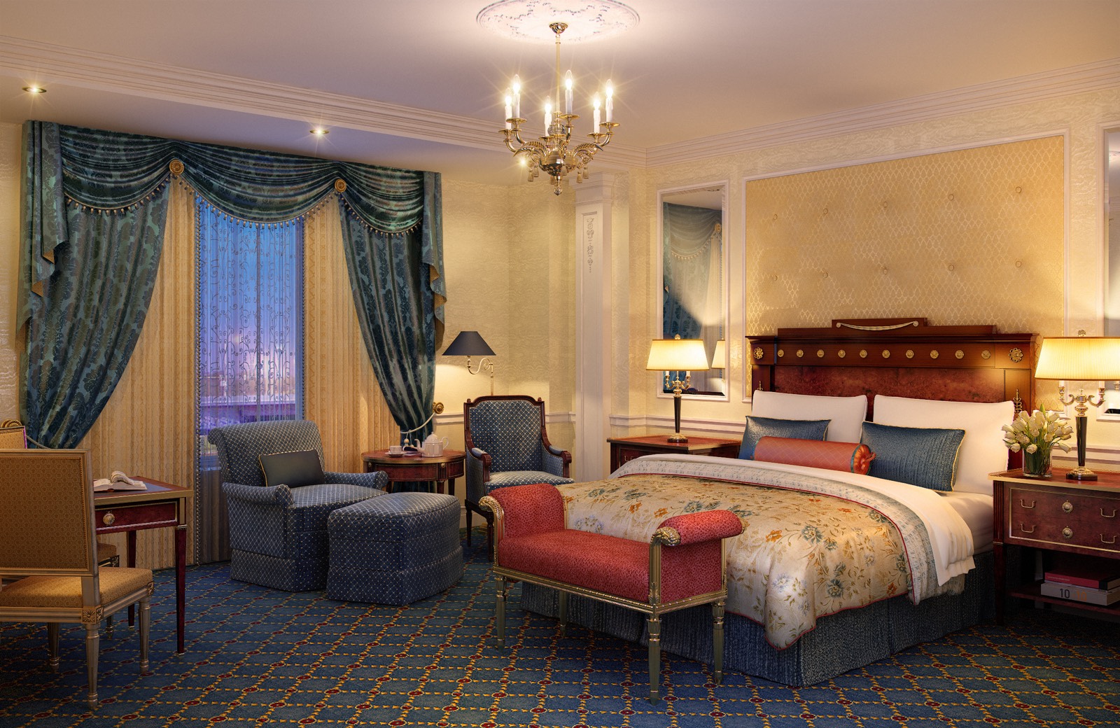
Curtains and seating do not have to repeat exactly the same colour. Reusing one colour over a broad curtain surface and a heavily used sofa can feel flat, and differences in light and texture mean the two materials will not look identical in practice.
A better approach is to establish a shared undertone or material character while giving each surface a different role. Curtains frame the architecture and manage light; upholstery carries the visual and practical weight of the seating.
How to build a tonal scheme
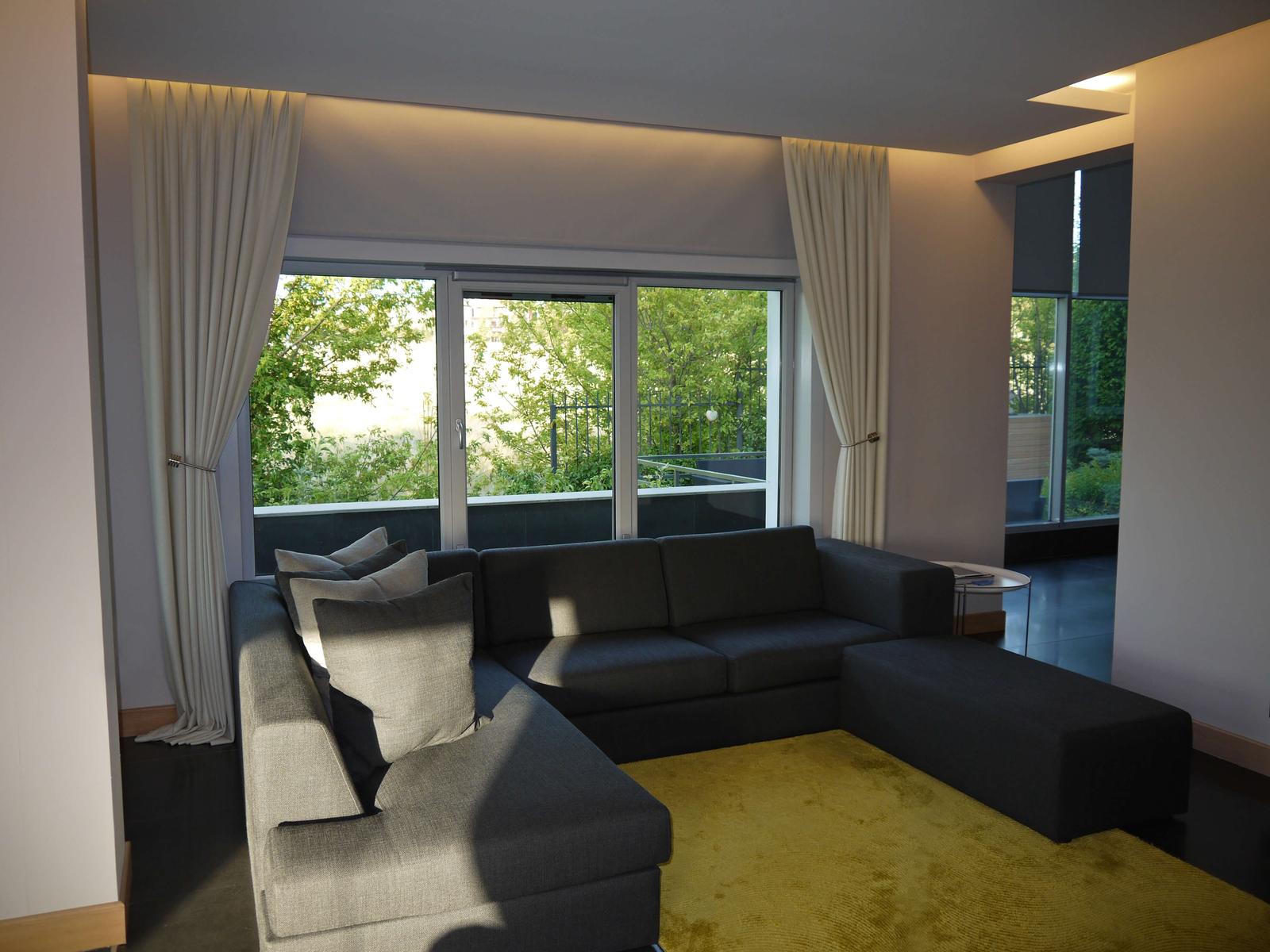
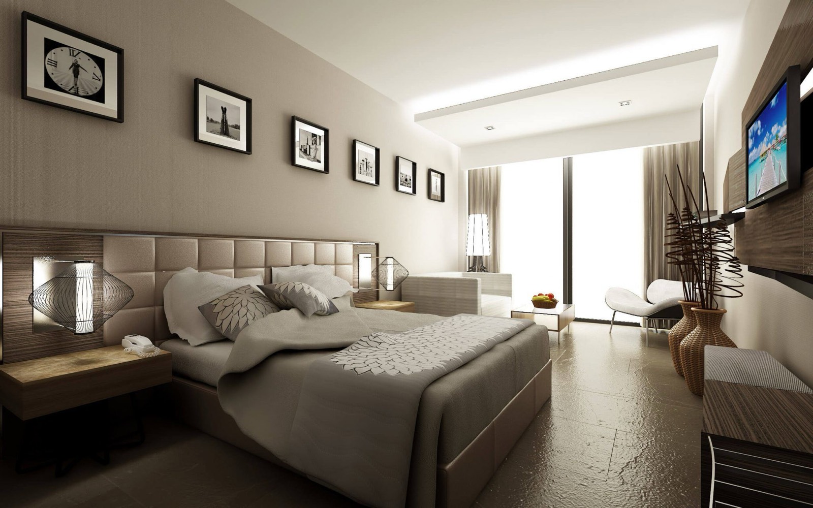
A tonal scheme uses lighter, mid and darker values from one colour family. A warm stone curtain, deeper taupe upholstery and pale beige cushions can remain related while keeping each surface distinct.
Undertone matters more than the name on the sample. Two beiges—one yellow, one pink—can look muddy together, so compare them beside the wall, floor and timber in the same light.
Control contrast through a colour hierarchy
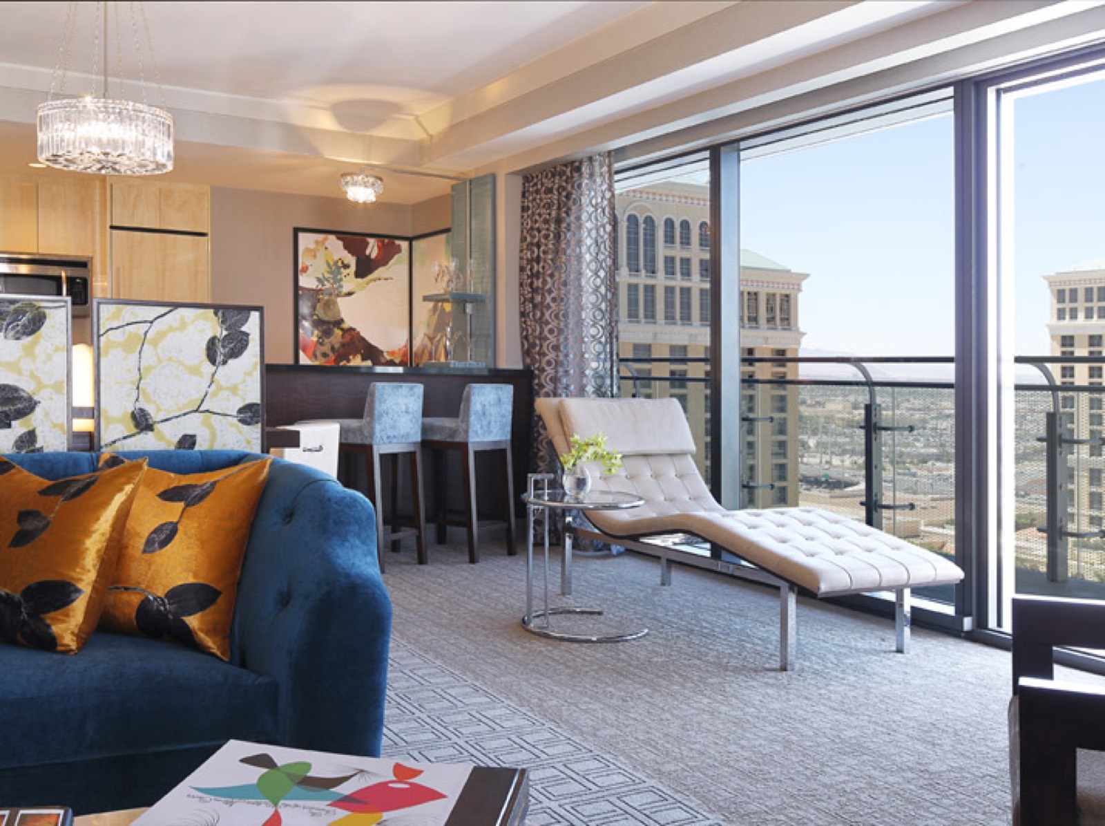
Contrast can separate curtains from seating, but it works best when colours have clear roles. Use a main colour on the largest surfaces, a secondary colour more sparingly and an accent only in smaller details.
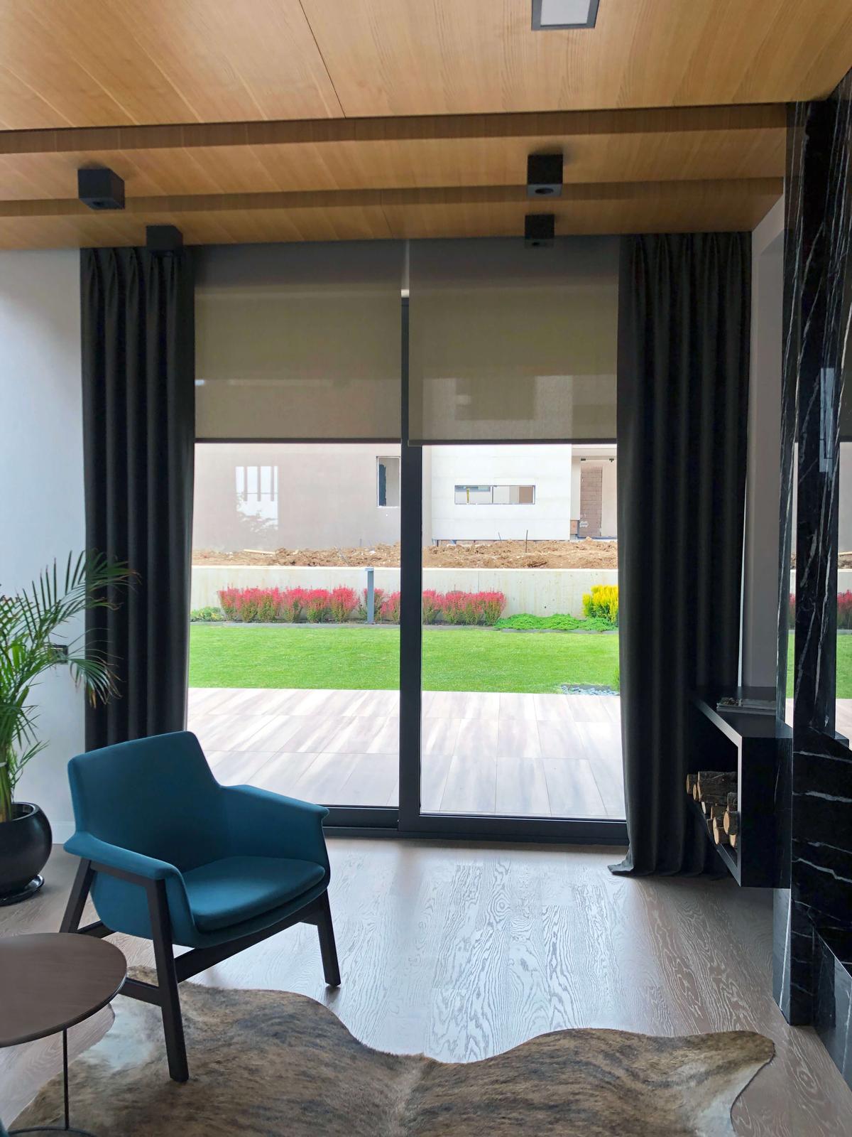
Dark curtains can frame pale upholstery, or a quiet neutral curtain can sit behind a colourful chair. Repeating the accent once in a cushion, piping or small textile creates a link without making both main surfaces compete.
Balance patterned and plain fabrics
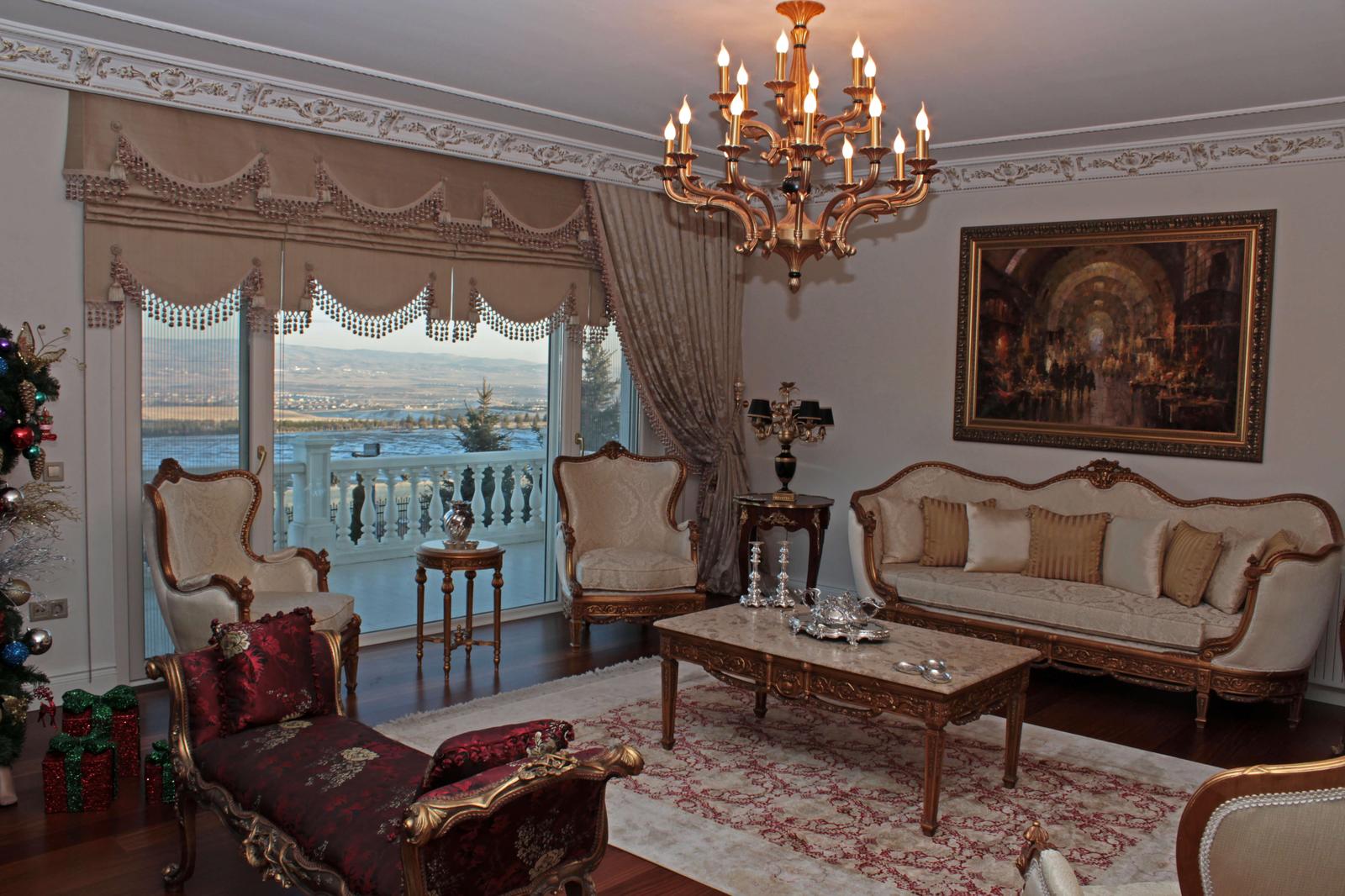
When patterned upholstery is the focus, a quieter curtain gives the pattern room to breathe. A plain curtain can pick up a secondary shade from the upholstery without competing with it.
If the curtain is patterned, simpler upholstery often produces a more controlled result. Repeating related patterns over two large surfaces can become heavy once repeat, scale and folds are taken into account; compare them at a realistic size.
Consider textures together
Velvet, linen-look cloth, bouclé and flat weaves reflect light differently. A smooth or slightly lustrous curtain can retain a distinct character beside matt textured upholstery even when the colours are close.
Textures need not match. Balance their visual weight: a dense velvet seat may suit a lighter draping curtain, while a natural-looking sofa can sit with a calmer curtain surface or a restrained note of sheen.
Mix warm and cool undertones deliberately
Timber, stone, metal and textiles may lean warm or cool. A blue-grey curtain can feel detached in a room dominated by walnut, cream and earth tones; a yellow beige can look unexpectedly warm beside cool stone and metal.
Warm and cool materials can coexist, but the contrast should be intentional and a neutral element should connect them. Use physical samples rather than judging from screen images.
Include rugs, walls and timber in the decision
Curtains and seating are not a two-item match. Rugs, paint, flooring, fixed joinery and stone cover large areas and can change the textile palette; two fabrics that suit each other may still conflict with the floor.
Identify the hard-to-change finishes first, then place curtains and upholstery within that palette. A small colour in the rug or the warmth of the timber can provide the bridge between them.
Textile continuity in large living spaces and villas
In a large room, curtains, seating groups and rugs are read together. A shared texture, undertone or detail is calmer than assigning a separate theme to every window or chair.
Continuity does not require one fabric everywhere. A curtain colour in one room may return as a cushion elsewhere; a plain weave on one seat may be answered by a pattern from the same palette on another.
Compare samples under the same light
Showroom light, daylight at the window and evening lamps all change colour. Hold a curtain sample vertically and against the light; view upholstery in its horizontal orientation to reveal differences in sheen and texture that a small swatch can hide.
Look at both samples in the room at more than one time of day, together with the walls and floor. The curtain-colour guide provides a more detailed method for assessing light and undertone.
Repeat colour and detail with restraint
Controlled repetition means reusing a colour, line or texture at different intensities rather than multiplying the same fabric. A curtain colour repeated once in a cushion, piping or occasional chair helps the eye connect the room.
As repetition becomes more frequent, the accent loses its purpose. Keep the main surfaces calm and use smaller textiles for details that may change with the season.
Quick selection guide
Build the textile palette together
- Start with permanent finishesRead the undertones of walls, floors, timber and major furniture.
- Assign the rolesDecide whether curtains, upholstery or smaller textiles will lead the scheme.
- View samples in placeCompare fabrics in the same light and in their vertical or horizontal orientation.
Related solution